Overview
A second pair of eyes, before the design review
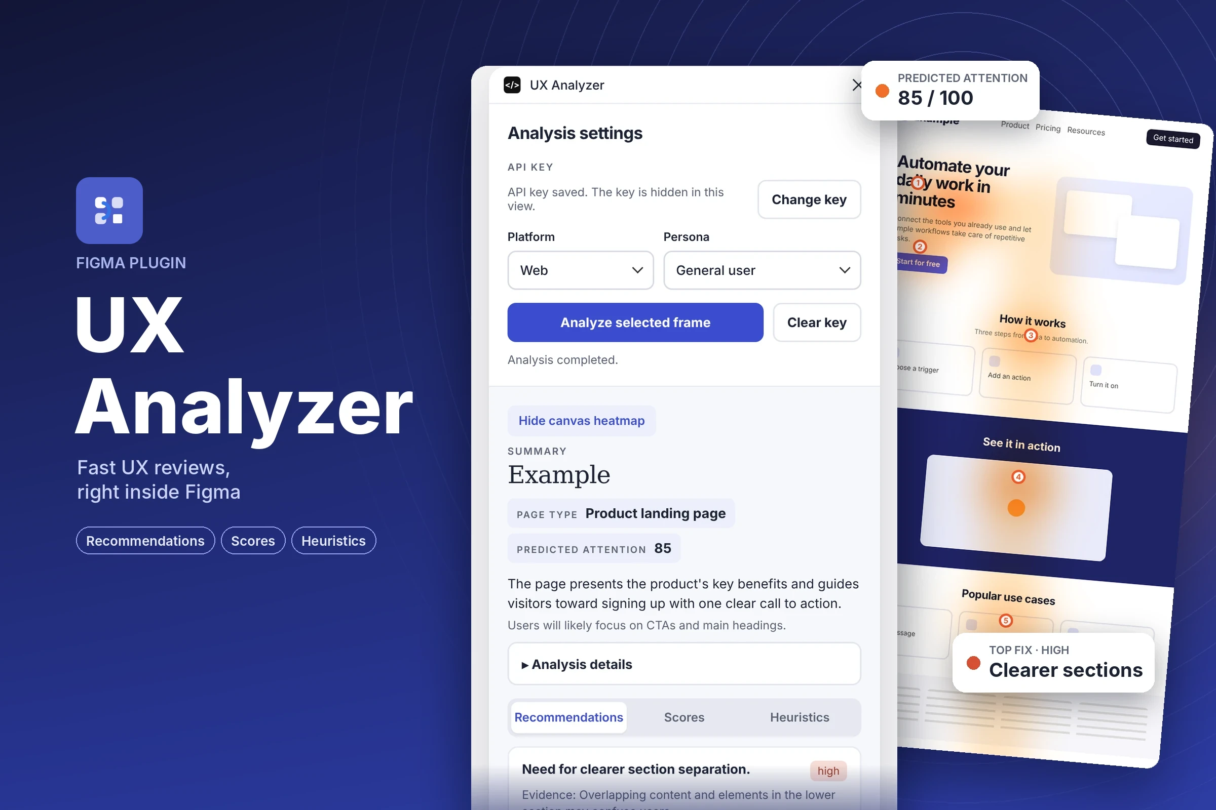
Feedback usually arrives late, in the next meeting. UX Analyzer gives designers a fast first opinion without leaving Figma: pick the platform and the persona, run the analysis, and get a clear view of what works, what may confuse users and what to change next. I designed the plugin and built it with AI-assisted development.
Setup
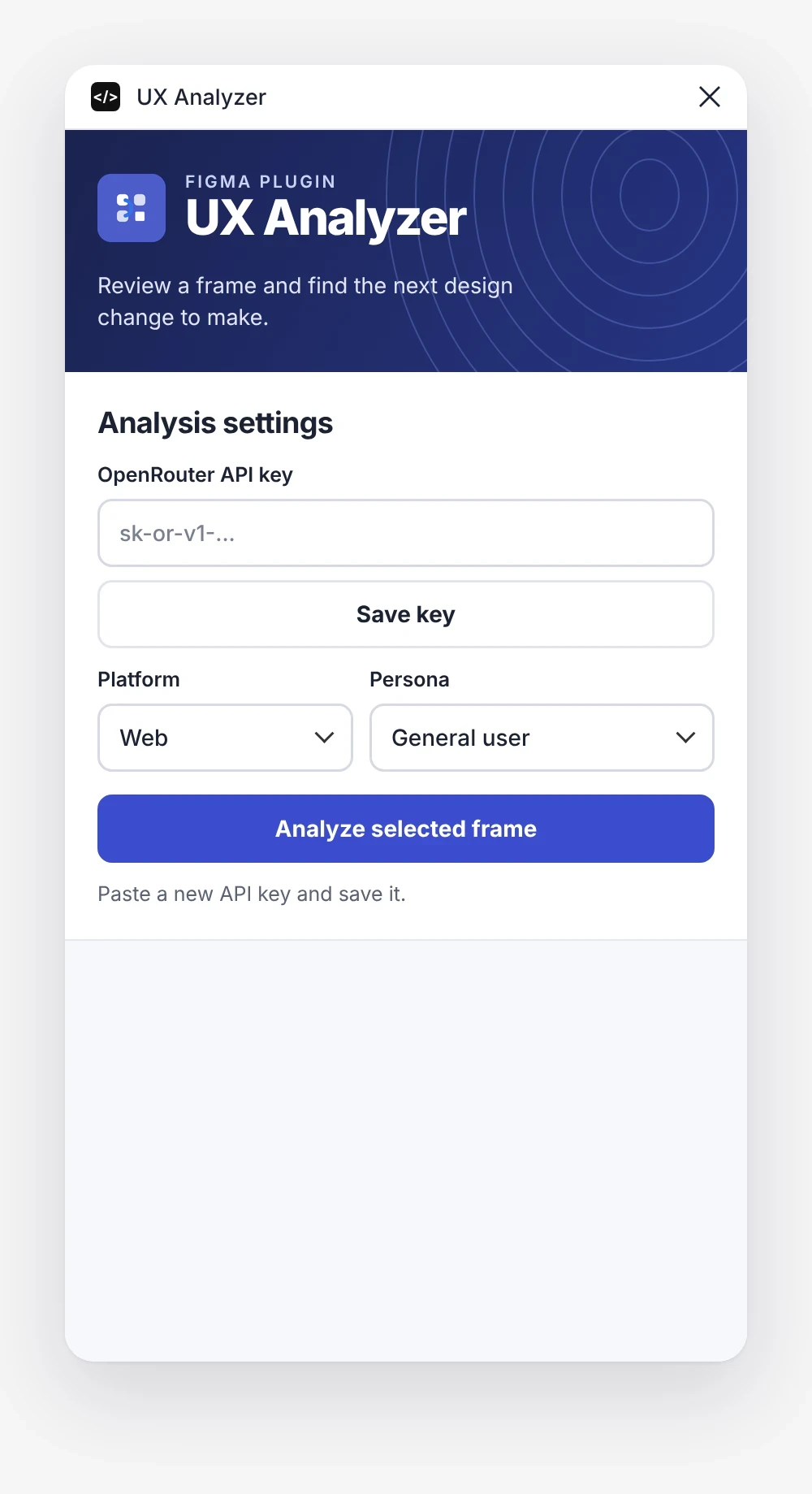
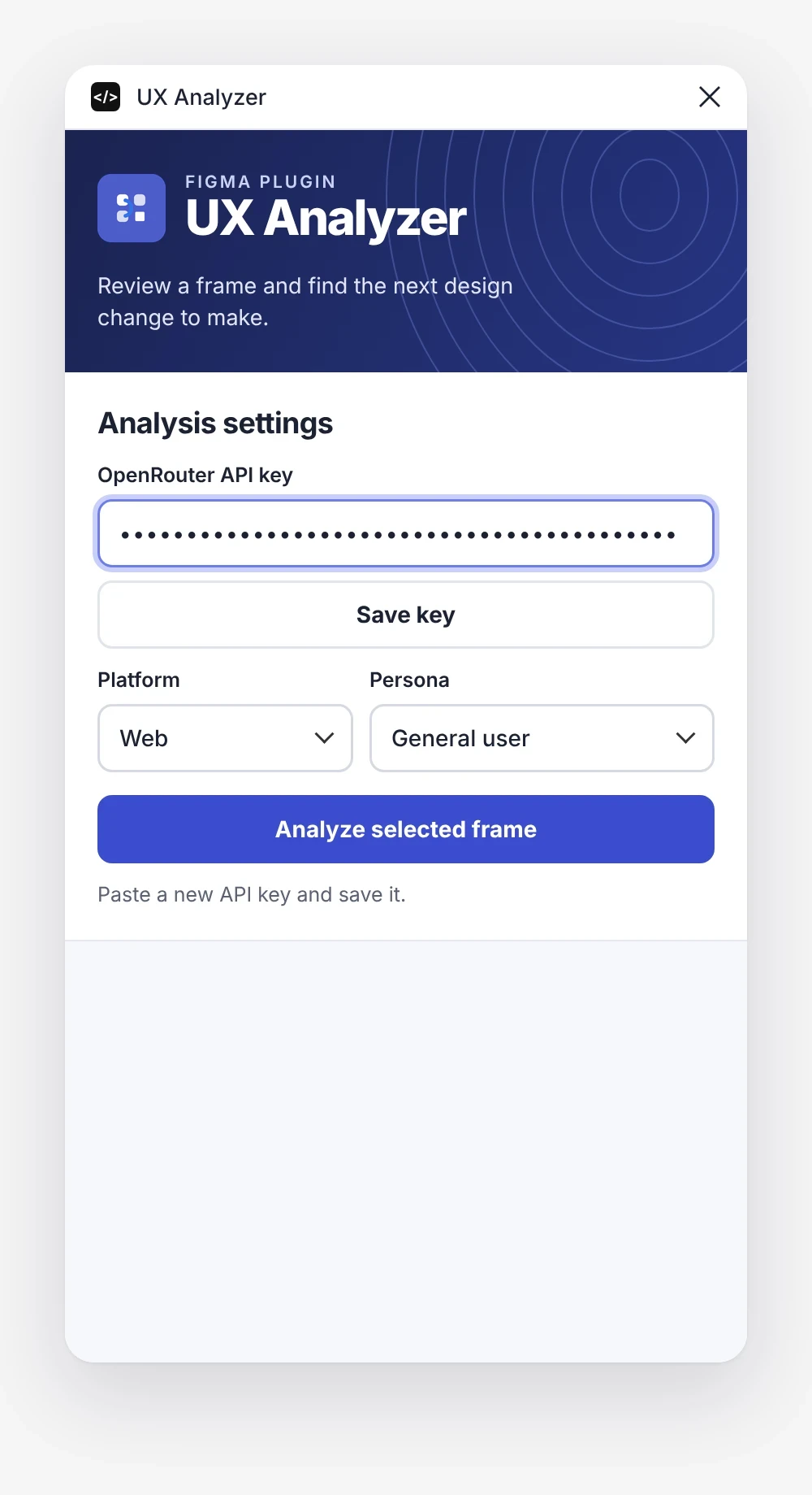
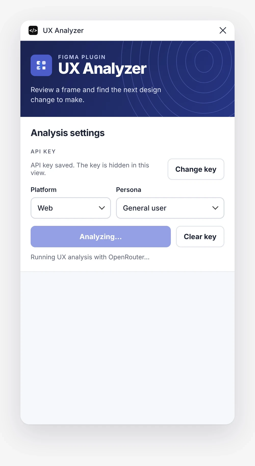
Three steps to a review
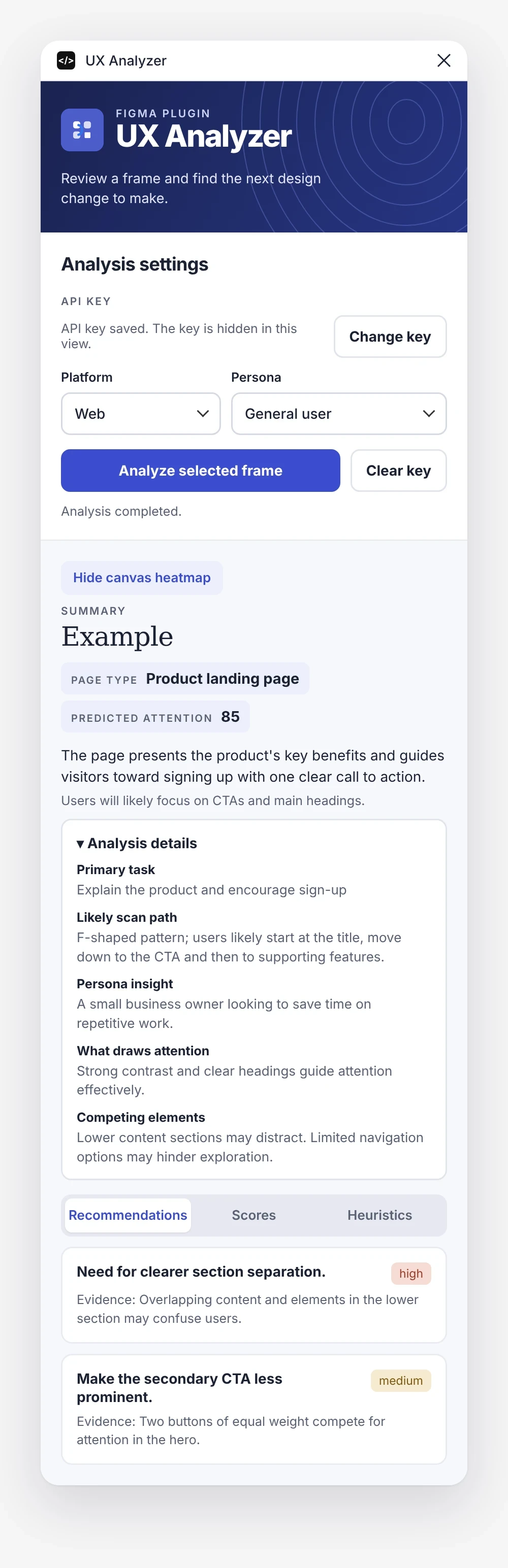
The settings stay short on purpose: one key, two choices and one button. The key is masked and hidden once saved, and the panel shows clear status while the analysis runs.
The review
Recommendations, scores and heuristics
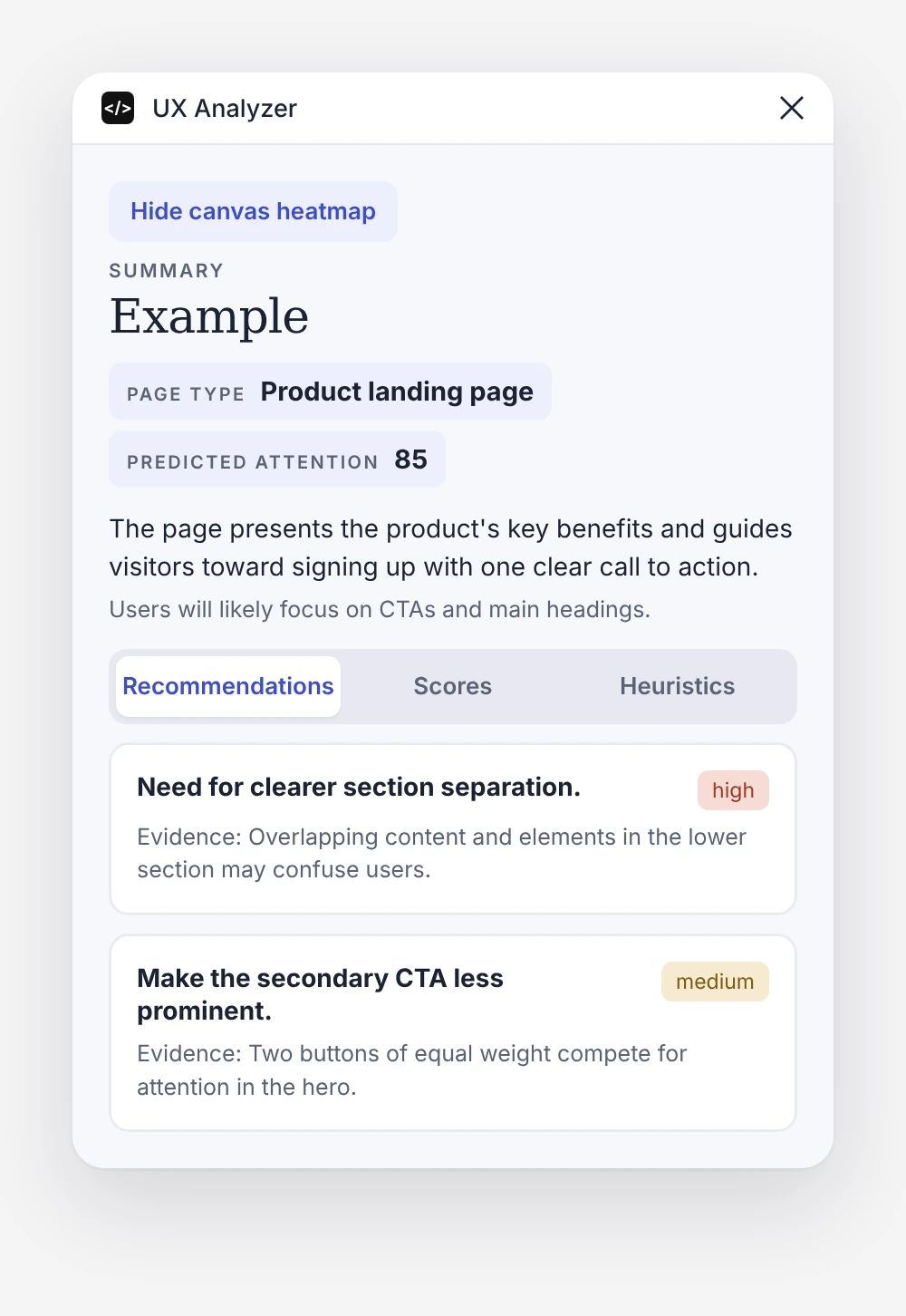
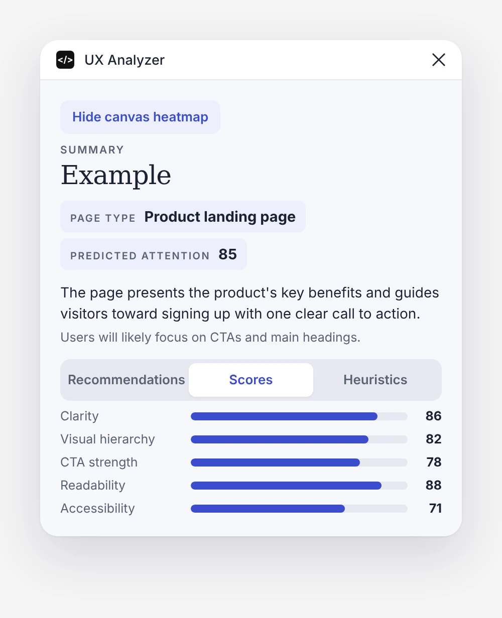
Every analysis opens with a short summary: page type, predicted attention and where users will focus. Three tabs then look at the frame from three angles.
The full analysis
- Primary task
- What the frame is trying to get users to do.
- Likely scan path
- How the eye moves through the layout, such as an F-shaped pattern from title to CTA.
- Persona insight
- How the chosen persona will read the page and what they are looking for.
- What draws attention
- The elements that pull focus, and why.
- Competing elements
- What distracts from the main action.
Heuristics
Built on Nielsen's 10 usability heuristics
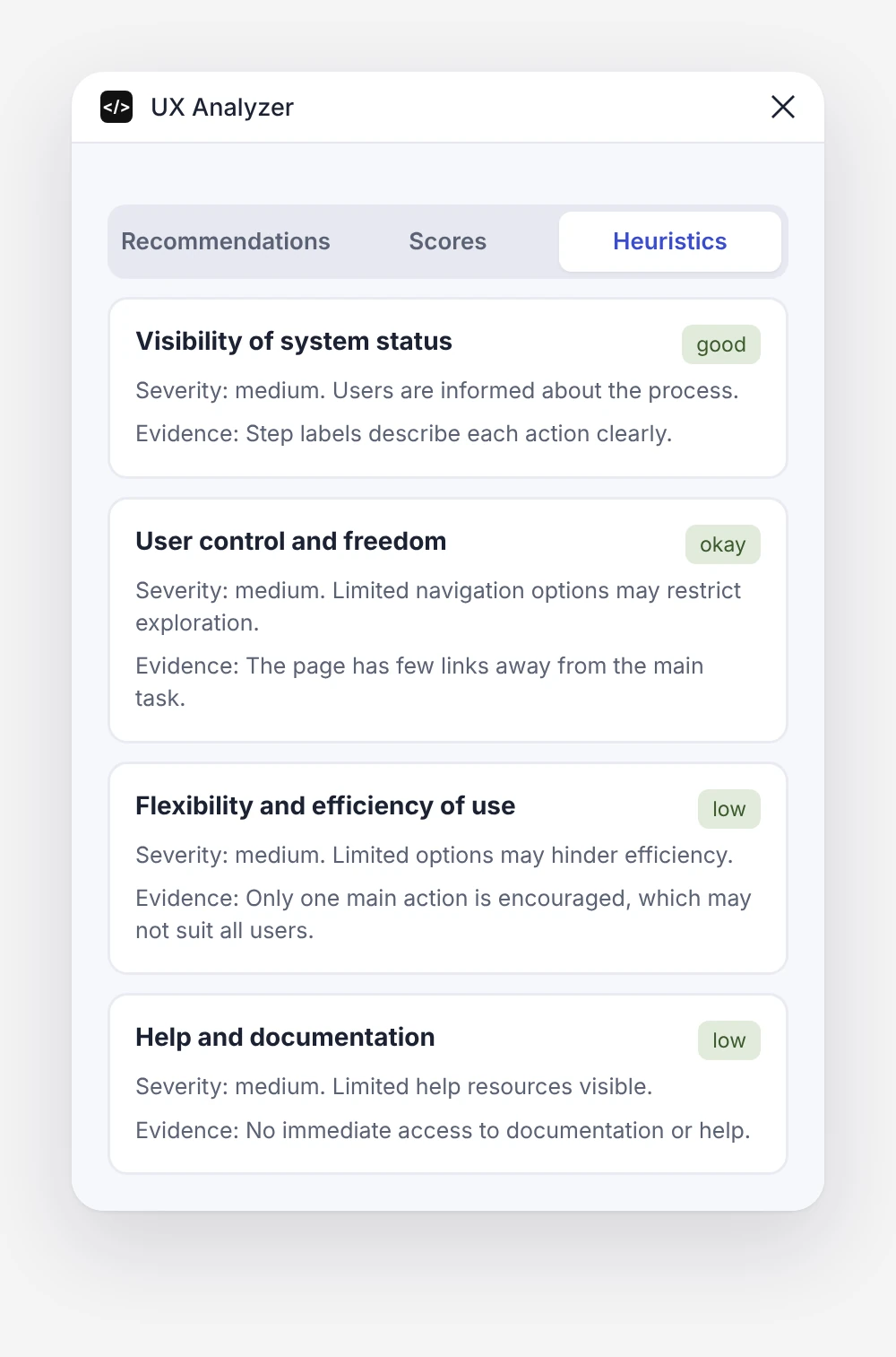
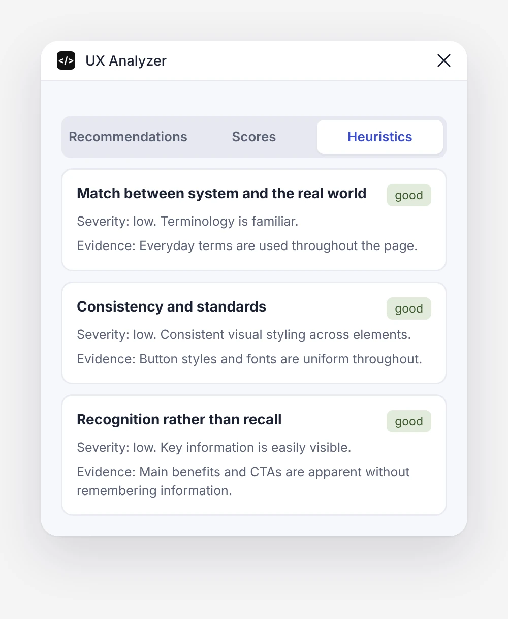
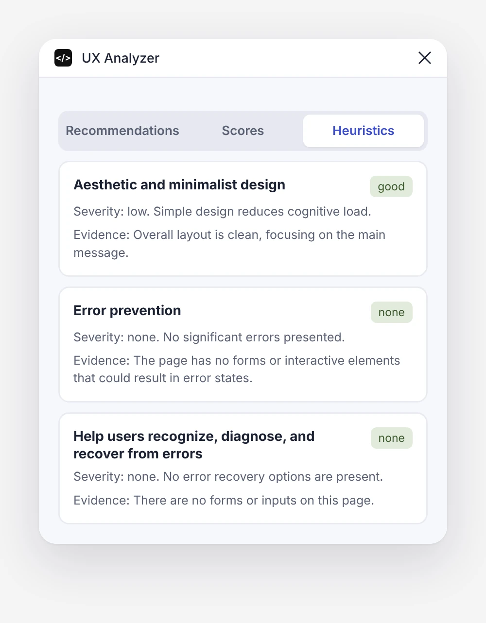
The heuristics tab checks the frame against Jakob Nielsen's ten usability principles. Each one gets a rating (good, okay, low or none), a severity level and the evidence behind it, so designers can see not only what is wrong but why.
Canvas heatmap
See the attention on the design itself
The plugin draws a predicted attention layer right next to the analysed frame, with numbered points along the scan path. It can be hidden with one click and is grouped neatly in the layers panel.
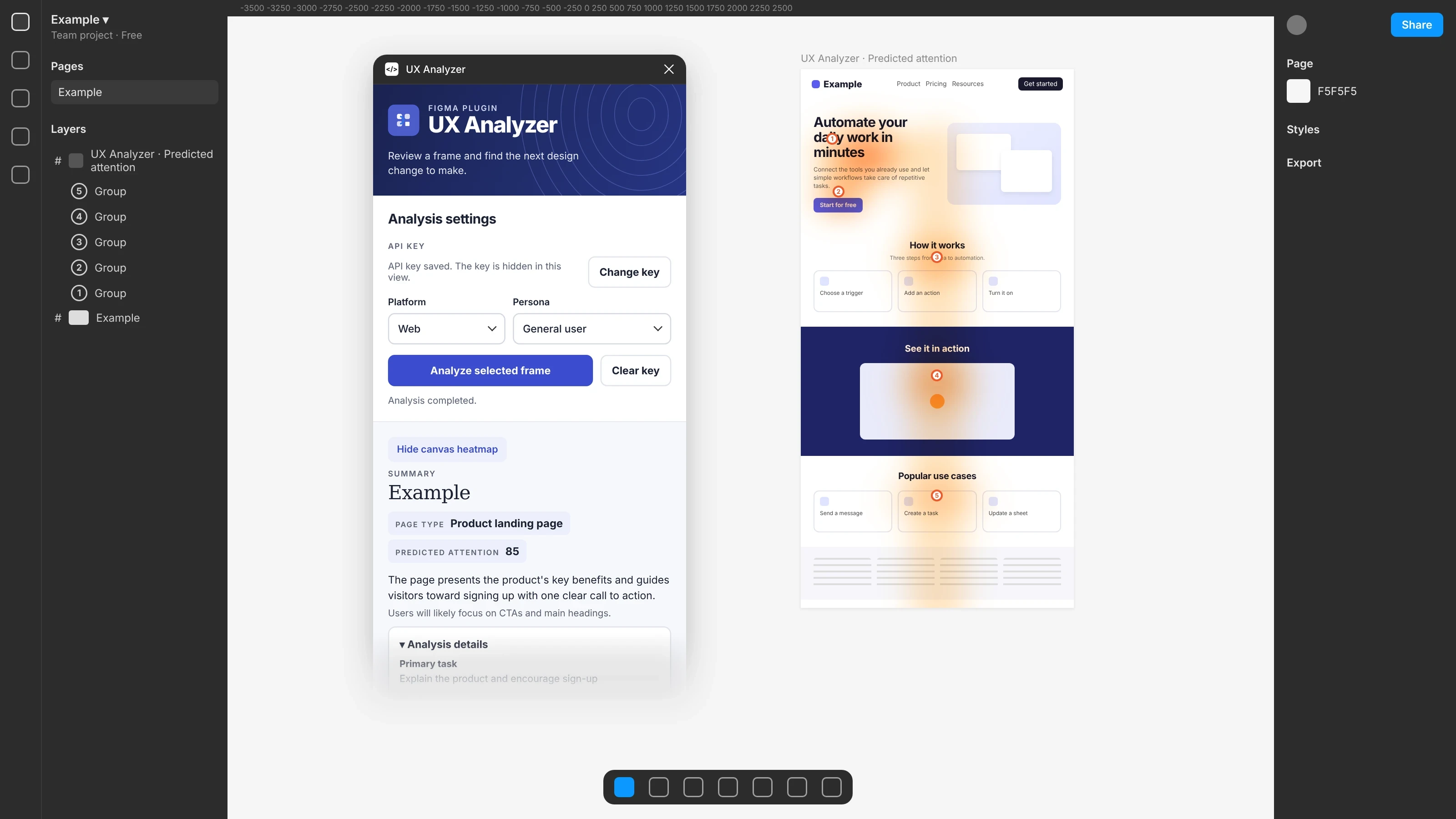
The analysed page shown here is an example layout.